

ModOps · Brand Therapy · Web
ModOps: Turning your ideas into impact
Visit the live site ↗The problem
Carrie and Regina are warm, quick and very direct. Their website was a tidy template with a stock seedling, a teal box that called them Modern Operations, and no faces until the third click. It was a little blander than they are, and they knew it.
The solution
We kept the logo they love and built everything else around the two of them: their own photos up front, their green brought forward, a serif with some warmth, and words that sound like them talking.
ModOps is Carrie Quintanilla and Regina Raudabaugh. They spent their careers side by side at Dell and frog, and now they come into creative and product companies as fractional operations leaders and untangle how the work gets done. In person they are warm, quick and refreshingly direct. Their website was none of those things.
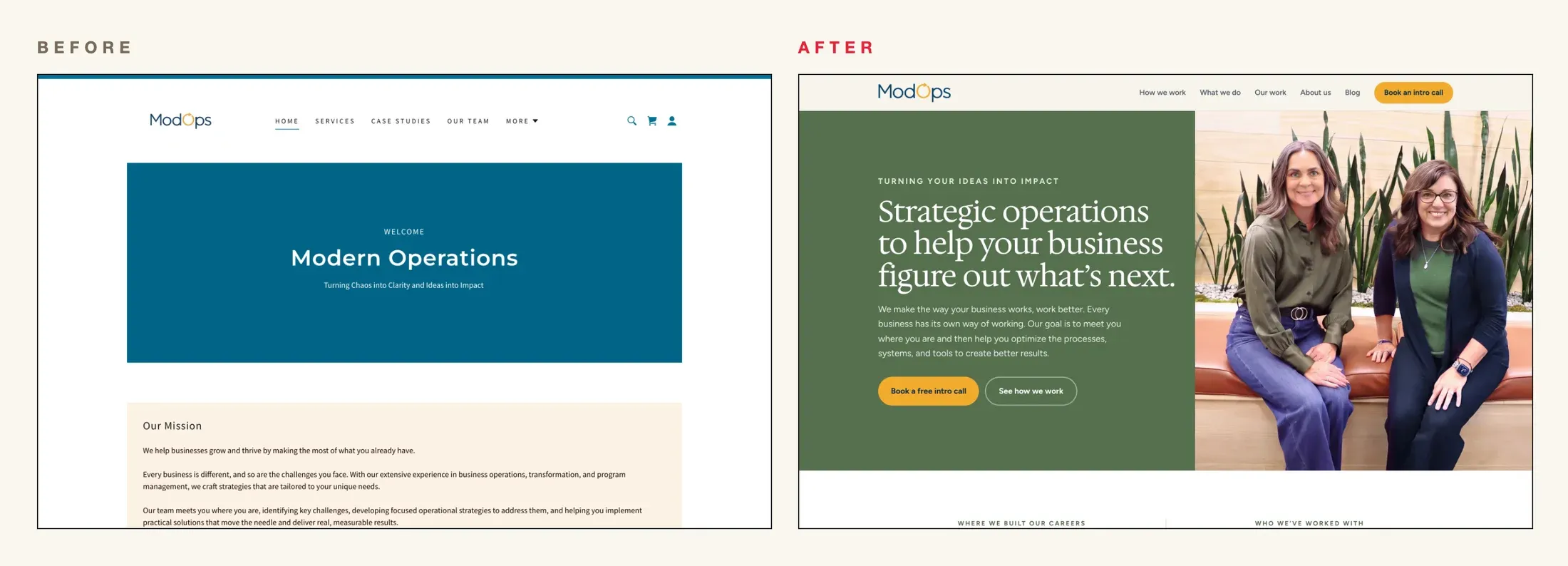
The old site was polite. A teal box said Welcome and Modern Operations, and they are ModOps, not Modern Operations. Below it came a mission statement, a seedling, a hand holding a lightbulb and a long feed of blog posts. There was no way to book a call, and no faces until you clicked Our Team. Nothing on it was wrong. Nothing on it was them.
So we started with brand therapy. In ninety minutes they told me plainly what they wanted: a site that felt like them, with their personalities in it. Their LinkedIn posts were already doing that, because they had stopped writing as a company and started writing as themselves. The website needed to catch up.
Their faces come first now. The home page opens on the two of them, on their own green, with a headline that speaks to the client: strategic operations to help your business figure out what’s next. Right under it sit their careers and their clients, Dell and frog on one side, McGarrah Jessee and TBG on the other.
The logo stayed. They love it, and the arrow inside its O turned out to be the best idea on the page. It became the wheels of a little car that drives across the home page, for the line they use to explain how they work: we build the map, then you take the wheel.
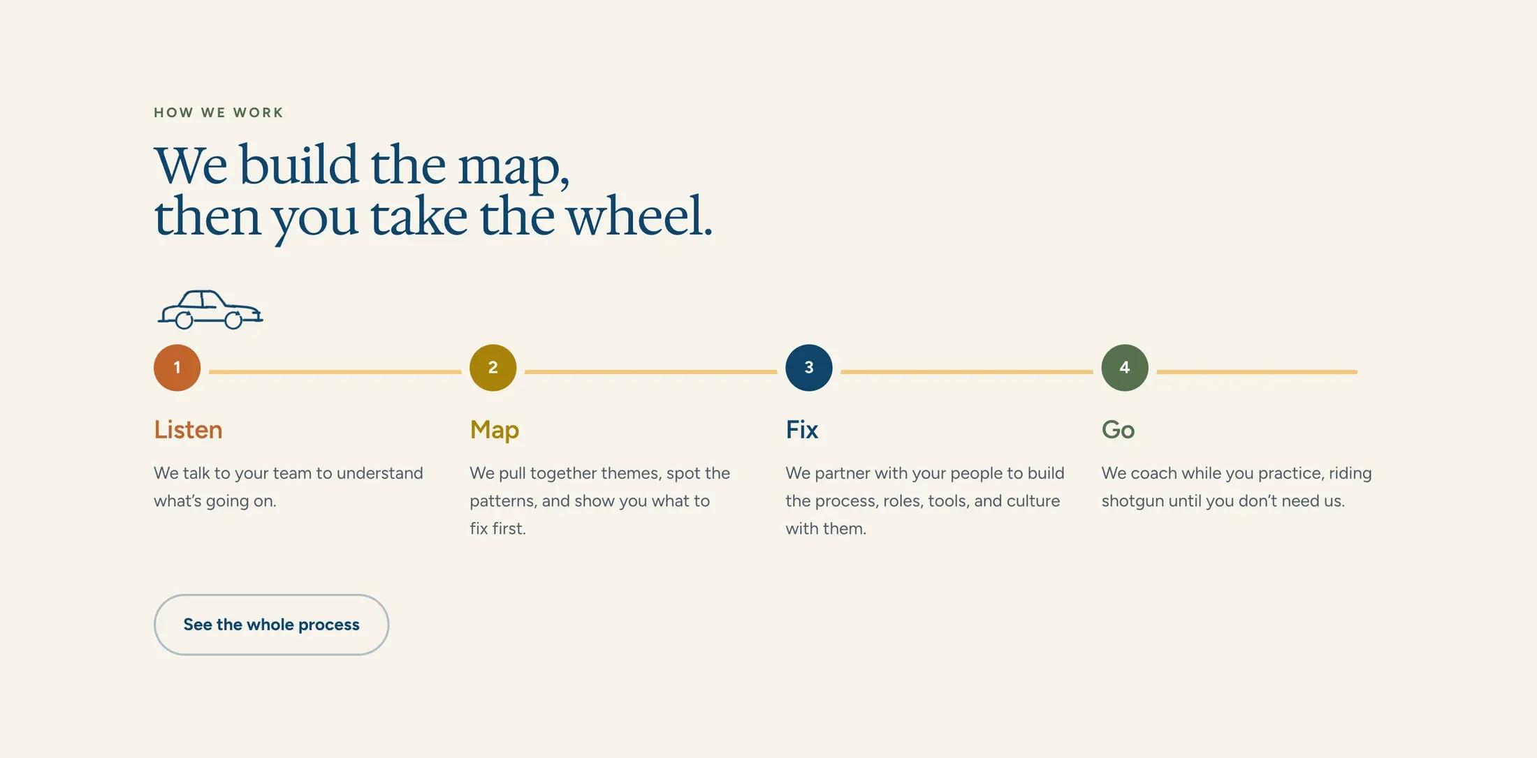
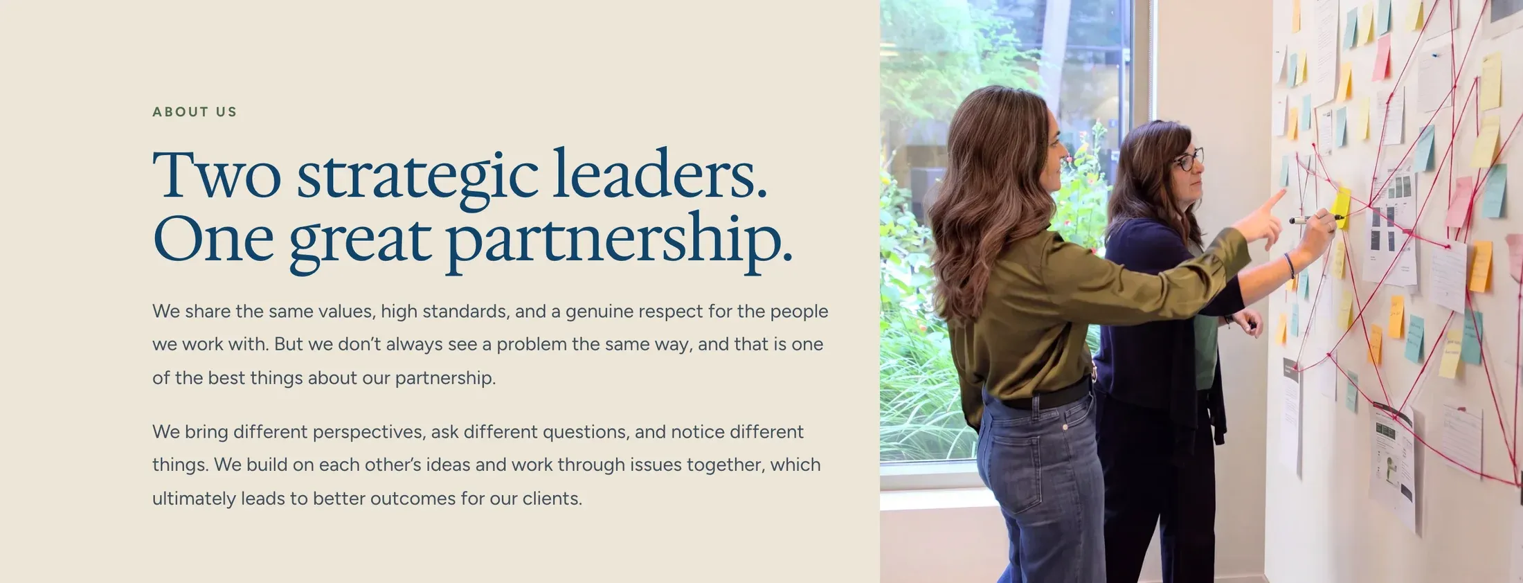
The rest is warmth with good manners. Navy from the logo for the headlines, set in a serif with some personality. Their green brought forward, and gold saved for the buttons. Thin line drawings that move a little. Blog covers shot like still lifes, one real object in soft light. And an About page that tells the story of their partnership, with the two of them at the wall doing the actual work.
And it is theirs. They write their own blog posts and case studies and add client logos themselves. Their email moved across without losing a single message, and the site lives in an account they own.